
What Makes Commercial Vehicle Wrap Design Work on Busy Tampa Roads?
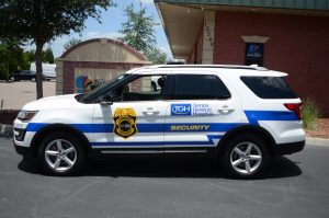
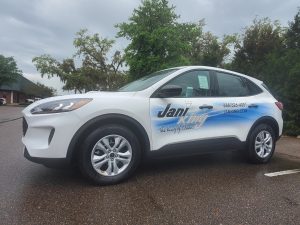
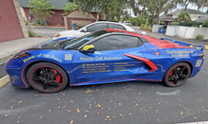
A commercial vehicle can be more than transportation. For Tampa businesses, it can also represent the brand while traveling through neighborhoods, commercial areas, highways, and job sites.
But an effective wrap is not simply about covering a vehicle with graphics. Commercial vehicle wrap design needs to work with the vehicle’s shape, viewing angles, traffic conditions, and the limited time people have to process the message.
Effective design combines clear visual hierarchy, readable graphics, vehicle-specific planning, smart panel placement, and consistent branding. The goal is to create a design that works when the vehicle is moving through traffic, stopped at an intersection, or parked at a customer’s property.
Start With the Vehicle Shape
Every commercial vehicle has a different shape and amount of usable graphic space. Vans, pickup trucks, box trucks, and trailers can have different doors, windows, curves, seams, and panel areas.
Before creating the artwork, consider:
- Doors and handles
- Windows and wheel arches
- Body lines and curves
- Seams and recessed areas
- Side and rear panels
- Overall vehicle dimensions
Planning around these features helps prevent important graphics from being interrupted or distorted.
A design may look excellent on a computer screen but appear different once it is applied to an actual vehicle. Vehicle-specific planning helps ensure that the final design works with the physical structure rather than against it.
Build a Clear Visual Hierarchy
People often have only a brief opportunity to see a commercial vehicle while it is moving. This makes visual hierarchy an important part of commercial wrap design.
A simple information structure can be:
Brand → Main Service → Supporting Detail → Contact Method
Designers can establish this hierarchy through font size, spacing, contrast, position, and graphic scale.
The goal is not to make every piece of information equally prominent. The most important message should be noticeable first, followed by supporting information.
A focused layout can communicate more effectively than a design filled with text and graphics.
Design for Different Viewing Angles
Unlike a website, a vehicle wrap cannot be viewed at the customer’s own pace. People may see a wrapped vehicle for only a few seconds while traveling through Tampa traffic.
A commercial vehicle may be viewed:
- From another vehicle
- At a traffic light
- While passing through an intersection
- From behind in traffic
- In a parking lot
- At a Tampa job site
Because of these different situations, the entire message does not need to appear identically from every angle. Each surface can have a specific role while maintaining the same overall brand identity.
This is especially useful for businesses that travel between customer locations, service appointments, and job sites across the Tampa Bay area and nearby communities.
Give Side and Rear Panels Different Roles
Side and rear panels are viewed differently, so they do not always need identical layouts. Each panel can serve a specific purpose within the overall design.
The side panel often provides a larger continuous area for the primary visual identity. It can include the business name, logo, primary service, supporting graphics, and essential contact information.
The rear panel can reinforce the business identity with a shorter message, website, phone number, or call to action.
Rather than treating the vehicle as one flat billboard, designers can treat it as a complete visual system where each surface contributes to the overall message.
Work Around Doors, Windows, and Body Lines
Physical vehicle features can create design challenges. Before finalizing the artwork, check whether important graphics cross:
- Door seams
- Handles
- Windows
- Wheel arches
- Deep curves
- Hinges or other hardware
For example, a logo may look properly positioned in a flat design file but become visually disconnected when it crosses a door seam or curved section.
Good commercial wraps account for these physical details before production begins.
Choose Typography and Color for Clarity
Decorative fonts may look attractive on a computer screen but can be difficult to read from a moving vehicle. For commercial wraps, typography should prioritize:
- Clear, readable fonts
- Appropriate text size
- Strong contrast
- Consistent typography
- Adequate spacing
- Limited font styles
Color also plays an important role in branding. Brand colors should support the design without making the layout unnecessarily busy.
When choosing colors, consider the relationship between text and background, brand consistency, outdoor lighting, and overall visual balance.
Adding more colors, larger text, or additional graphics does not automatically create a better wrap. Each design element should have a purpose.
Avoid Turning the Wrap Into a Brochure
One common design mistake is trying to list every product or service on the vehicle.
A commercial vehicle does not need to function like a complete company brochure. Instead, the design should focus on the information customers are most likely to need.
For example, a business name, primary service, recognizable branding, and essential contact method may communicate more clearly than a long list of services.
A focused design also gives the logo, graphics, colors, and important information enough space to remain visually clear.
Make the Design Fit Tampa’s Driving Environment
Businesses using vehicle wraps in Tampa operate across busy streets, highways, neighborhoods, commercial areas, customer properties, and job sites.
That means the design should work in different real-world situations, including when the vehicle is:
- Moving through traffic
- Stopped at an intersection
- Parked outside a business
- Arriving at a customer’s property
- Working at a service or construction site
- Traveling between appointments
For businesses operating multiple vehicles, fleet graphics can help maintain consistent branding while allowing designs to adapt to different vehicle sizes and shapes.
The local driving environment should influence practical design decisions without making the artwork feel overloaded with location-specific elements.
Review the Design Before Production
Before finalizing the design, business owners should review the artwork on the correct vehicle template and ask:
- Is the business easy to identify?
- Is the main service clear?
- Can important text be understood quickly?
- Are important graphics interrupted by doors or windows?
- Does the side layout work properly?
- Does the rear communicate effectively?
- Does the design look balanced from different angles?
- Does it remain clear when viewed from a distance?
Reviewing these details before finalizing the vehicle wrap in Tampa can help identify layout problems while they are still easy to correct.
What Makes Commercial Vehicle Wrap Design Work?
Effective commercial vehicle wraps generally combine:
- Clear visual hierarchy
- Vehicle-specific planning
- Readable typography
- Appropriate color contrast
- Focused messaging
- Smart panel placement
- Consistent branding
- Limited unnecessary text
- Graphics that work from multiple viewing angles
The strongest design is not necessarily the busiest or most complicated. It is one that communicates clearly while working naturally with the vehicle’s shape and real-world surroundings.
Final Takeaway
For Tampa businesses, successful commercial vehicle wrap design should be planned around the vehicle, the viewer, and the driving environment.
Start with the vehicle’s shape, establish a clear visual hierarchy, keep the message focused, use readable typography and appropriate contrast, and review the complete design across different surfaces before production.
When graphics, layout, typography, and branding work together, the finished vehicle can present a professional and consistent image wherever it travels.
Frequently Asked Questions
What makes a commercial vehicle wrap design effective?
An effective commercial vehicle wrap combines clear visual hierarchy, readable typography, appropriate contrast, consistent branding, and a layout that works with the vehicle’s physical shape. It should communicate important information without making the design feel crowded.
How much information should go on a commercial vehicle wrap?
A wrap should prioritize the information customers need most. A business name, primary service, recognizable branding, and an essential contact method may be enough. Too much text can make the message difficult to understand, especially when the vehicle is moving.
Why does vehicle shape matter in wrap design?
Doors, windows, seams, handles, curves, and wheel arches can interrupt graphics or affect how they appear. Using the actual vehicle’s dimensions and a suitable template helps designers position important elements more effectively.
How should commercial vehicle wraps be designed for different viewing angles?
Different surfaces can serve different purposes. Side panels may carry the primary visual message, while rear panels can reinforce the business name, service, website, phone number, or a short call to action. The overall branding should remain consistent across the vehicle.
How can Tampa businesses make commercial vehicle wraps work on the road?
Businesses should consider the vehicle’s size, typical routes, viewing angles, traffic conditions, and where the vehicle will be parked or used. A focused layout, readable graphics, clear branding, and practical panel placement can help the design work across different driving and business environments.

 Previous Post